DEVELOP
In this part of the development, I started to find common user interface patterns in similar apps to ZooMate. I considered three features that I may or may no use; maps, purchasing tickets, and alerts. Based on these patterns, I developed sketches with similar functions. Finally, I created two paper prototypes, one for how to use the map function and the other one for the scanner function instead of the purchasing tickets and alerts functions
UI PATTERNS
SKETCHES
Map

CONCEPT 1
This first concept has a scroll and tab pattern. Whether The thumbnails are laid out on a grid or the thumbnails have detailed descriptions or have different locations scattered all over a map, all these require the user to scroll up and down the screen and tab the final destination where the user wants to go


Tickets

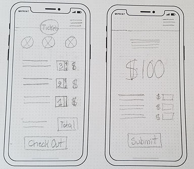
CONCEPT 2
The ticket purchasing section has a more clear and transparent structure than a map page. There are almost no graphics, the total dollar spent is placed in a large font. The items are described in detail so the user has a clear picture of the total value of her purchase. My inspiration came from all three examples above. I took different parts from them and applied them to the ticket section of the app


Alerts


CONCEPT 3
The research showed that people would like to be alerted of events during their visit to the zoo. The pattern of setting up these alerts is based on a one-tap setup. The user could tap a preset notification laid out on a grid, slide notification buttons from red to green, or turn on and off various notification settings. I very much liked the alert concept of the car bursting through on the third example of this audit


PAPER PROTOTYPING
There are two sections of paper prototypes. The map section is where the user navigates to a given destination. In the scan prototype, the user will take steps to scan and listen to the audio to retrieve the information he seeks
MAP at a glance
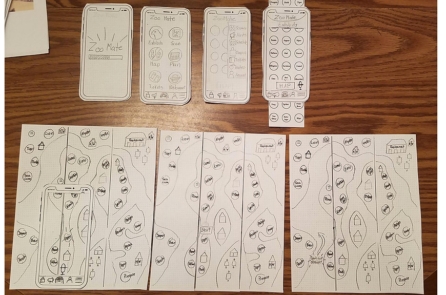
This is the starting point of the map section. This represents the ideal way users solve the walking through the steps to get to their destination
User interaction and feedback

Steps 1, 2, 3
The user had difficulty in step number 3. He mentioned that it will be helpful to have animals categorized and have their names below the pictures. He knew that he doesn't always know what the difference in the appearance between two exotic animals is and, therefore, visual and written cues are needed

Steps 4, 5, 6
The user thought that it will be a good idea to have a zoomed-out view of the whole map that fits on the phone screen. He thought that if he is on the other side of the zoo from the place he wants to go, he would like to know in one view where other interesting exhibits are on his way
Scanner function at a glance

This at a glance view of the ideal steps to get information via the scanner
User interaction and feedback

Steps 1, 2, 3
These steps have two different ways to get to the scanner. One of the users said that it was confusing to have two menus to get to the scanner. The other user showed no problem interacting at this stage. She opted to use the home menu

Steps 4
This step shows a close view of the moment the user scans the QR code on the exhibit's signage

Steps 5, 6
The final step when the user gets the animal's profile screen after scanning the QR code. Then he clicks the audio bottom, and finally, he listens to the audio information. Users didn't have any problem with these steps
Wireframing
Wireframing With Annotations Version 1

Wireframing With Annotations - Revised
This is the most recent wireframe version after receiving feedback. I added additional screens needed for the missing steps and were important for the user to accomplish the task successfully

LINK TO INTERACTIVE WIREFRAME - REVISED
Heuristics Evaluation
VISIBILITY OF SYSTEM STATUS
The system should always keep users informed about what is going on, through appropriate feedback within a reasonable time.
MATCH BETWEEN SYSTEM AND REAL WORLD
The system should speak the users' language, with words, phrases, and concepts familiar to the user, rather than system-oriented terms. Follow real-world conventions, making information appear in a natural and logical order.
USER CONTROL FREEDOM
Users often choose system functions by mistake and will need a clearly marked "emergency exit" to leave the unwanted state without having to go through an extended dialogue. Support undo and redo.
CONSISTENCY AND STANDARDS
Users should not have to wonder whether different words, situations, or actions mean the same thing. Follow platform conventions.
ERROR PREVENTION
Even better than good error messages is a careful design which prevents a problem from occurring in the first place. Either eliminate error-prone conditions or check for them and present users with a confirmation option before they commit to the action.
RECOGNITION RATHER THAN RECALL
Minimize the user's memory load by making objects, actions, and options visible. The user should not have to remember information from one part of the dialogue to another. Instructions for use of the system should be visible or easily retrievable whenever appropriate.
FLEXIBILITY AND EFFICIENCY
OF USE
Accelerators, unseen by the novice user, may often speed up the interaction for the expert user such that the system can cater to both inexperienced and experienced users. Allow users to tailor frequent actions.
AESTHETIC AND MINIMALIST DESIGN
Dialogues should not contain information which is irrelevant or rarely needed. Every extra unit of information in a dialogue competes with the relevant units of information and diminishes their relative visibility.
HELP USERS RECOGNIZE DIAGNOSE AND RECOVER FROM ERRORS
Error messages should be expressed in plain language (no codes), precisely indicate the problem, and constructively suggest a solution.
HELP AND DOCUMENTATION
Even though it is better if the system can be used without documentation, it may be necessary to provide help and documentation. Any such information should be easy to search, focused on the user's task, list concrete steps to be carried out, and not be too large.
Visual Inspirations
The following images show the development of three visual inspiration boards that are of different looks and styles. Next, I have explored different color palettes and typefaces that will best fit the theme on the zoo app. Further exploration of icons, UI elements, and logos helped to narrow doesn't what will be the final look of this zoo app
Moodbaard and Design Board
I narrowed down the mood boards to three different styles, natural, vibrant and sketch like looks
CONCEPT 1 - MOODBOARD

CONCEPT 2 - MOODBOARD

CONCEPT 3 - MOODBOARD

CONCEPT 1 - DESIGN BOARD

CONCEPT 2 - DESIGN BOARD

CONCEPT 3 - DESIGN BOARD

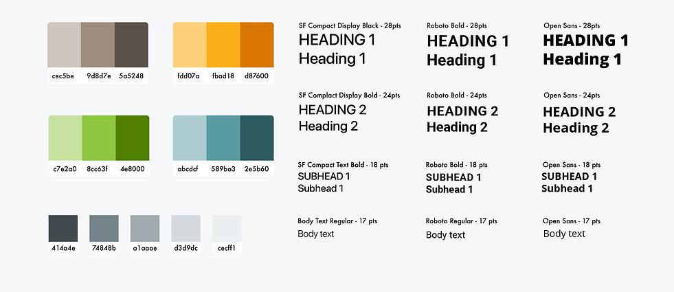
Color Pallet and Type Study
These colors were inspired by the most common colors found in nature and other zoo apps. I added also a grayscale palette for the headings and body text. Regarding the type, I only chose san serif examples since they are much easier to read on a small screen.
Icon Study
I liked these three sets of icons because they distinctly show the identifiable animals.
UI Elements Study
I wanted to test which UI elements will fit better with the look of this app.

Logo and Icon Explorations
The set of logos and icons on the left have more details than the ones on the right. The first typeface is Arbotek Ultra. The typeface on the right is Acumin Variable Concept

Final - Color, Typeface and UI Elements
I decided to keep the colors I initially selected because they fitted well with the theme. Regarding the typeface, I selected Roboto. I like the clarity and strength of this typeface. For my links and buttons I think the better typeface is orange

Final - Logo, Home Page Icon, UI Elements and Supporting Icons
For the app logo, I simplified the icon so it could fit in all types of media. I chose not to use any of the animal econ sets I found initially. I thought that they may not represent clearly the animals on display. I designed my own simple icons to be recognizable in one look.

